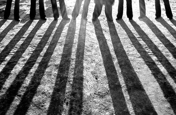
Our team is highly interested in using light as a visual communication tool in order to tell our narrative. Light can me manipulated and used in so many ways as an effective means on storytelling – it controls ambience and the mood of a piece, so much so that a change in lighting directly changes the environment. Changes in lighting can effect the audience’s perception of a setting, a dark and cold environment, once lit with soft warm lighting, completely shifts an atmosphere.
“Stained Glass” was a concept that received a positive reception from the team, we all liked this concept of light reacting through the prism of coloured glass, and how we could take these effects and play with them for our 15 second animation. However there was slight hesitation in running with this kind of idea as we need to recognise our own limitations before we get too ahead of ourselves, lighting is notorious for being difficult to get to grips with in Maya, and our time is so so limited. So much so that we could spend too much of our allocated time budget learning the fundamentals of effects that may not even work in the end. It’s all a matter of which risks are worthwhile.
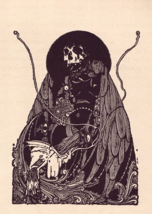
Nevertheless, research was done into the stylistic possibilities of stained glass. We looked at the Gothic Irish Artists Harry Clarke (left) and Aubrey Beardsley (below.) The dark approach and graphic juxtaposition of extreme detail against negative space seems like such a fascinating visual direction in which to take a short animated film, but once again it’s a matter of execution. And also we need to recognise that our limitations are not conceptual at this point, but technical.
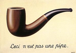
Narrative-wise at this stage I was very inclined to research ideas surrounding a surrealist approach to story-telling. This largely derived from our group’s interest in light and shadow work as well as a common interest in abstract visual elements. I was looking into the early Surrealist painters, particularly Rene Magritte, whose observations provide interesting grounds upon which to base a narrative. For instance,
“Everything we see hides another thing, we always want to see what is hidden by what we see.”
The idea challenges the perception of the viewer – an idea communicated masterfully through the thought provoking piece “La fidelite des images”/”the treachery of images”. The idea being that the images that the viewer believe to be a certain object, or concept, are not what they seem to be but are rather a representation of what they can be perceived to be. The Treachery of Images, 1929, is a painting, a series of scores on a canvas in an arrangement of colour that could be seen to represent a pipe. This image is followed underneath by “This is not a pipe”, this idea directly challenged contemporary attitudes (brought about with the rise of photographs and early cameras) of accepting images at face value for being what they represent.
Surrealism challenges conventional notions of the viewer, The Treachery of Images creates a paradox out of our understanding of how words and images correspond to one another. In terms of building a narrative out of this concept, it would have to challenge the viewer’s perception of what was happening. Within the 15 second short, the built up perception of what the viewer thinks is happening is shattered by a final reveal. In visual arts and narrative, indirect and direct surrealism is the philosophy of perception and debate over the nature of the conscious experience. We could have had something that explicitly questioned the notion of whether the world we see around us is the real world itself or an internal perceptual copy of that world that is generated by our brains’ means of processing and understanding the world. This is the philosophical position that our conscious experience is not of the real world itself but of an internal representation;
Narrative based around the audience’s perception of what is happening, the character appears to be something that it is not, revealed that it is the character’s shadow being cast and created.
Alexey Bednij
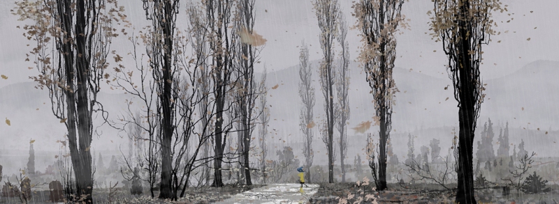
Trees. We were interested in forest settings, everybody seemed to be inspired by this. Photography series following ancient tree stumps, National Geographic.
Post just to talk about some of the crazy range of ideas we had at a stage in which we probably should’ve had already narrowed down our final concept.
C’est la vie such is life. Yeo.
We talked about forests, about characters running through forests. We were really interested in Caitlin’s silhouette tree graphics! A character running through the forest, a reveal that the character, some kind of monster, that tricks the audiences perception of what is actually causing the fear in the forest. Reveal. It’s man! The vegans were right. Man is the enemy.
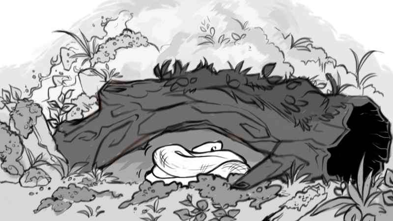
Ok. Simplification of ideas. We can’t rig a rock monster. Fuck. What’s easy to rig? How do you rig anyway? Does anybody know? No? Fuck. Ok. Snakes? Well snake could be cool as fuck. Rock monster snake? Combine ideas?
Maybe. There’s tutorials online for snakes. How hard is a snake? It’s like, organic string? Bound to be easy.
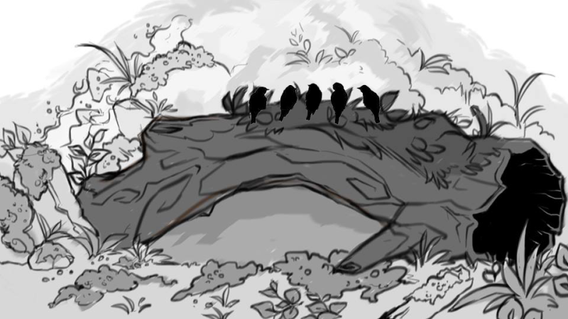
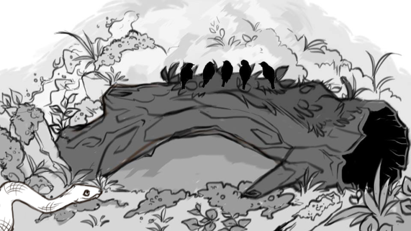
Cue tester animatic. Cartoon snake. Birdies.
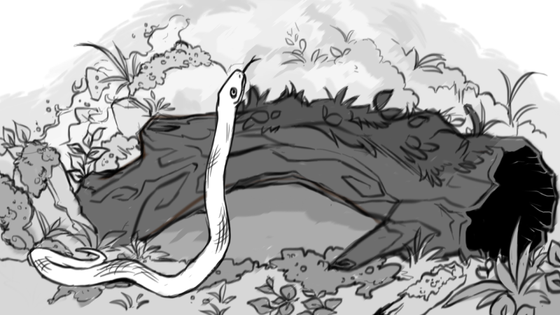
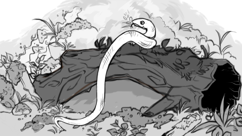
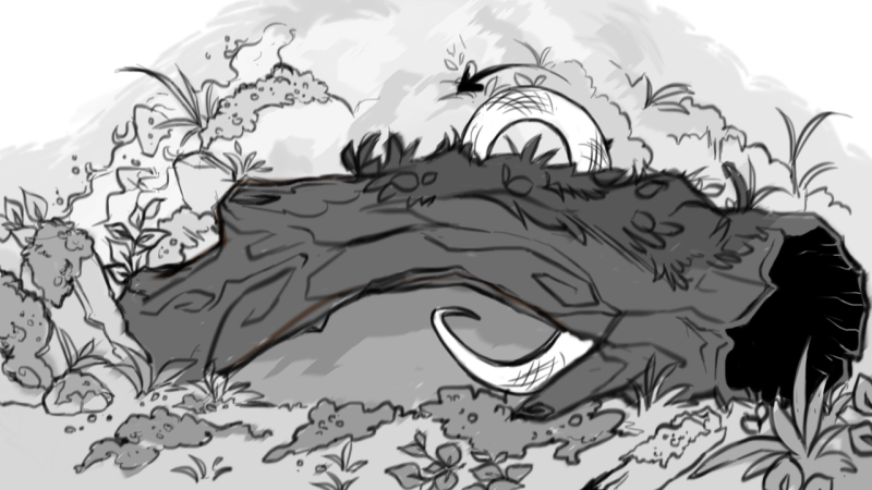
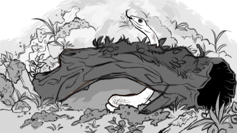
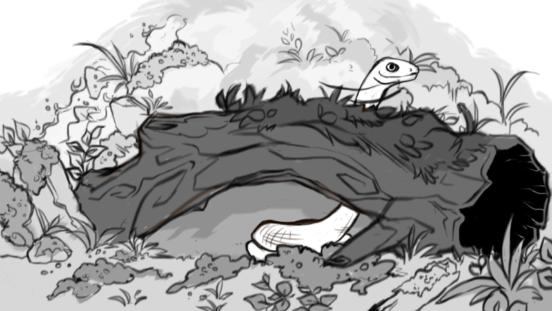
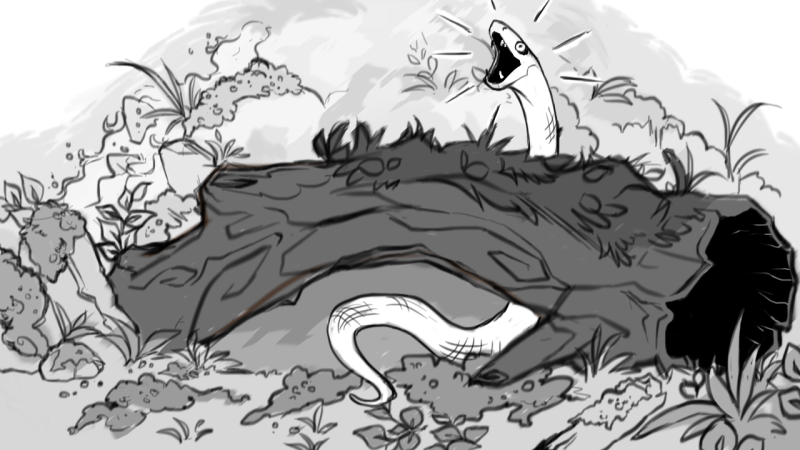
Nobody was really happy with the below images that made our 2D animatic. We couldn’t even bear to show it to the class and present because nobody was strongly behind the idea. I drew out the backgrounds and the snakes in various poses, but it’s no good! It’s way too Disney, our team needed to be behind something.
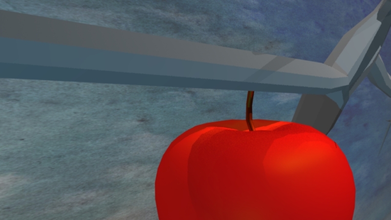
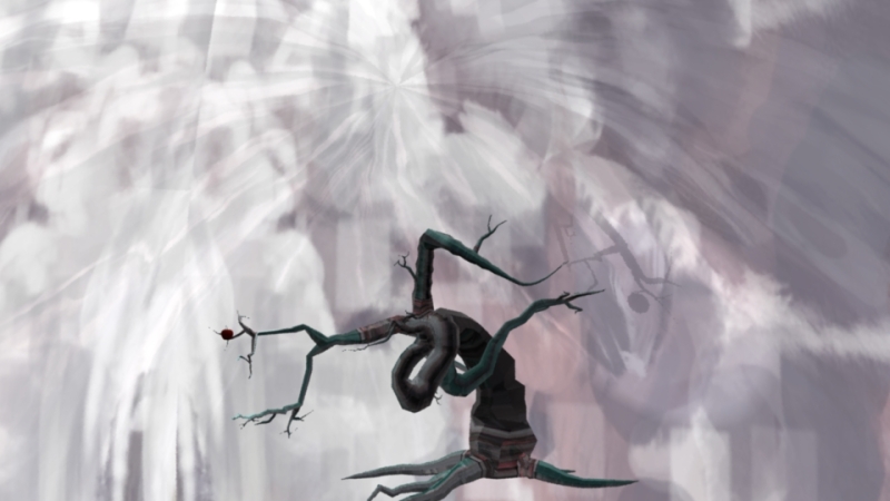
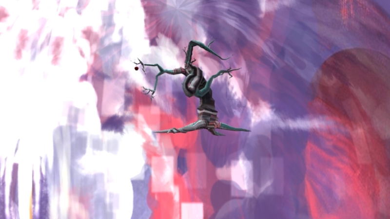
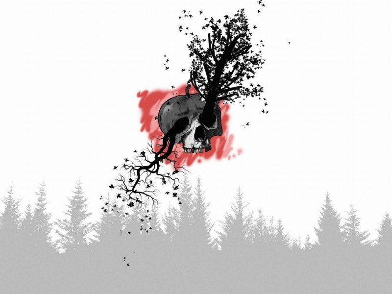
And this is where I said “B)” and went a lil off the rails and dove into RIGHT SNAKE SYMBOLISM. Adam & Eve. Apples. A rotting singular tree, with mad graphics going on inside the background! A Poison Tree, William Blake, GCSE English Literature returns to me in this moment
Apples, trees, snakes, religion, rotting, decay and death – rich symbolism. x
As a team we tried our best to take on board the feedback we got back from Conann and the tutors. I met individually with Conann after Caitlin and Jonny to get first hand feedback and to discuss how we could improve our animation. We were told to rework certain aspects;
Camera & Editing – we had spent a lot of time perfecting our models into grand sculptures but the strange camerawork took away from the visual strength of our pieces.
Lighting – lower the reflectivity and shininess of the entire animation so that it’s less of a visual mindfuck for the audience.
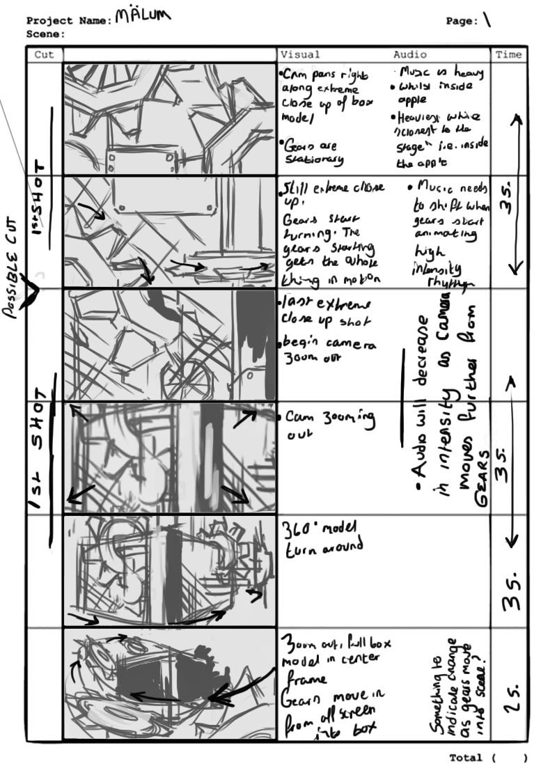
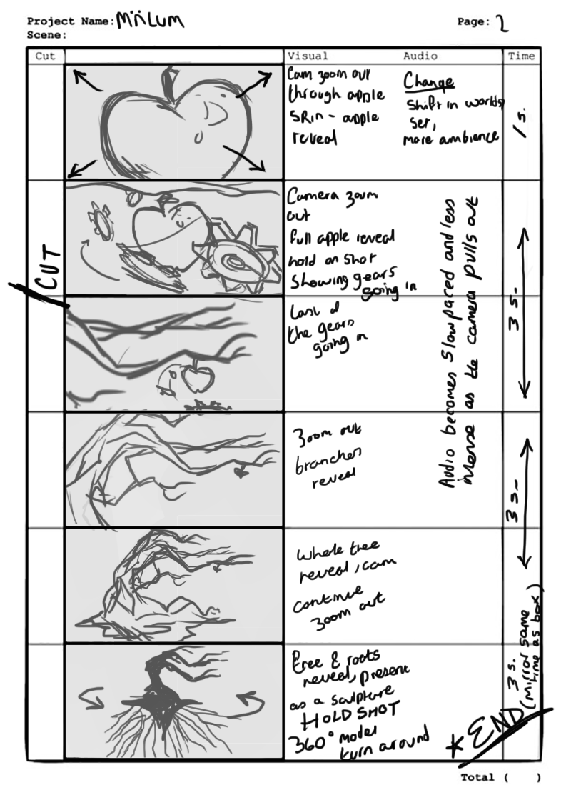
Sound Design – redesign the audio almost entirely so that it captures the contrast between the internal and external environments of this techno apple. The interior, with it’s highly mechanical aesthetic would be loud and harsh, and as the camera draws further from the mechanical box the audio should become more melodic and ambient – taking full advantage of the difference in atmosphere. Sound should drive the project, and the visuals should take cue from the nuances in sound design.
Based off of these suggestions we decided as a team that we really needed to rework the entire animation to incorporate these suggestions and to fully implement these. Admittedly, we rushed our first cut of the animation for the presentation deadline, and poor prior planning led to a visually interesting (I admit I still like our first output! Never forget) but overall confused final product. Cue rework and restoryboard!
Plan shot by shot when working in teams. Insure everyone is on the same visual wavelength x
I went into extreme detail with this storyboard!! To try and regain a bit of order with our take 2! Although this is not an exact plan of our final outcome and we changed the storyboard a bit after team discussion is was something more of a plan that we had the first time! The storyboard visual was stage 1, and our sound design was essentially a second storyboard, so with the sound design and timing set we were able to work in unison.
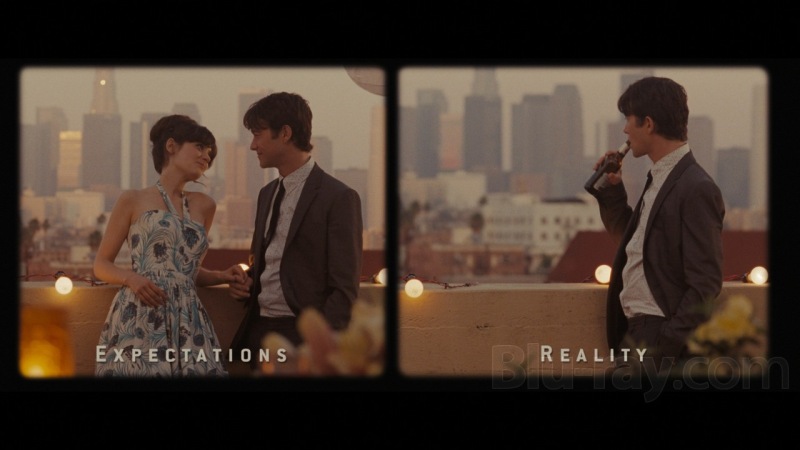
For the beginning shots in editing we wanted the gears to appear incredibly clustered, the visual would be jam packed and chaotic, to contrast against the ambience created by the powerful tree model in later shots. A landscape grid was used to mirror scenes on top of each other, I was thinking about the juxtaposition created in the striking and memorable scene contrasting Expectations vs. Reality in a grid from 500 Days of Summer.
Camera wise, me and Eoin went about re twigging the scene showing the external environment showcasing the tree model. We took out and scrapped my earlier background, it was a remnant of an earlier concept – just because work was high quality or took a lot of the budget, if it’s not relevant to the current concept it should be scrapped so our whole piece feels planned out. Instead we went for a more subtle acid wash texture. It adds something of an ethereal presence I think.
We wanted to focus and highlight the model as a sculptural fine art piece. I feel like it contrasts well against the earlier symmetry in the mirrored grid of the merging gears. I removed the earlier animation of the helix gears being absorbed into the apple, although I liked the visual I’d created, I’d thought it’d be best for the overall finishing image and agreed with the team’s suggestion.
And below is our final cut! Finally got there in the end, and while I can appreciate our first cut of the animation in it’s mystical aesthetic, I’m actually delighted with what we have to show as an end piece. At first I was nervous because I thought that their wasn’t enough of my own input immediately visible in our end product but thinking back I remember my contributions to the ideation process and conceptualisation, as well as helping out and having my place in bringing out the end result.
I’m so happy with my team as well and proud of us all in bringing about this final piece of work. We’ll have this piece of work to remind us of what we were able to achieve despite the stress and tension and pressure.
Our original idea was to have our apple spin through a series of transitions, each transition represented a next stage in mankind’s advancements. Our animation was split into various tasks, at this stage the background was just as important an aspect of storytelling as it communicated our crucial concept of transition. Although the background would later be dropped as we changed our set up process and story (we dropped the transitions following animatic feedback, and the background was dropped) I had done a lot of prep work and research on developing the concept which is probably worth sharing.
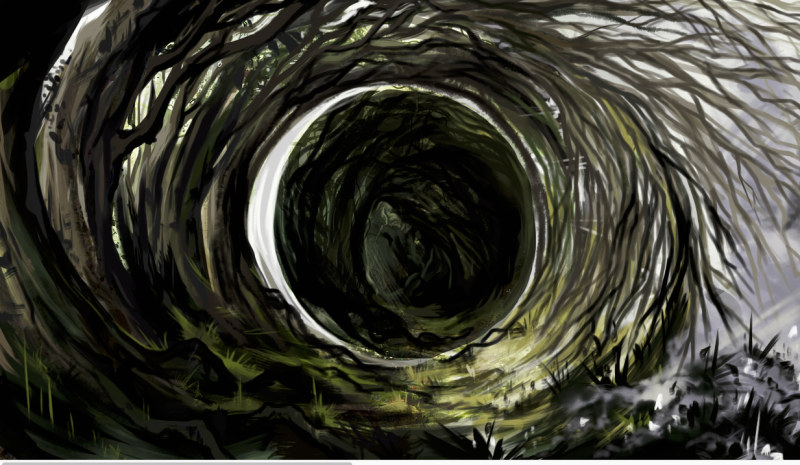
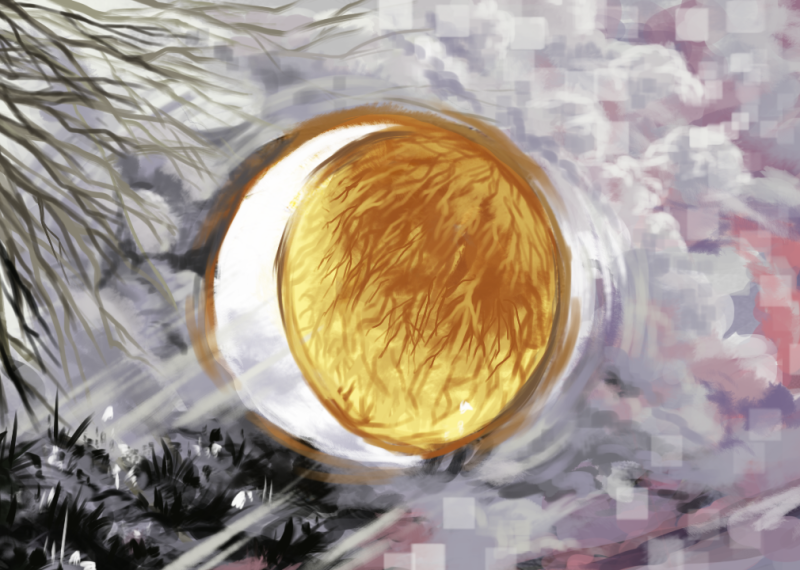
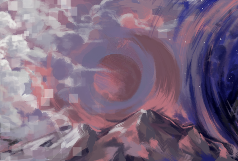
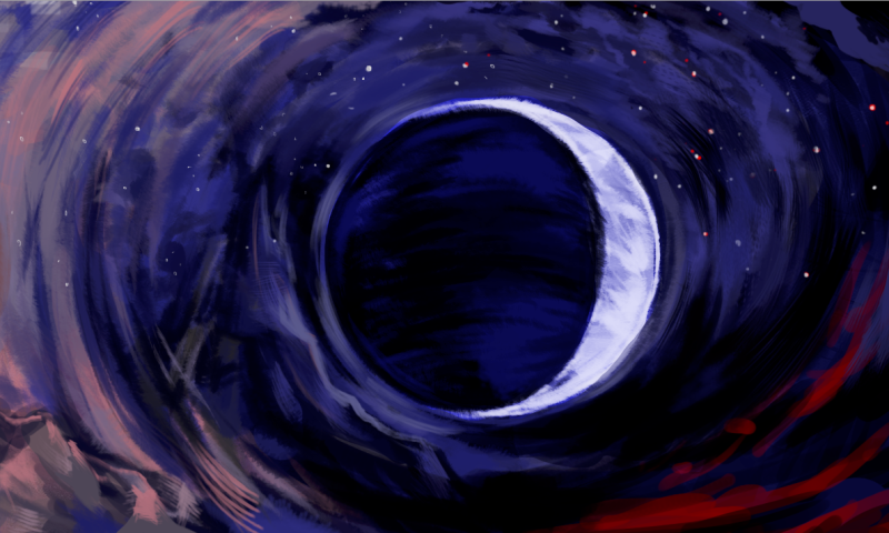
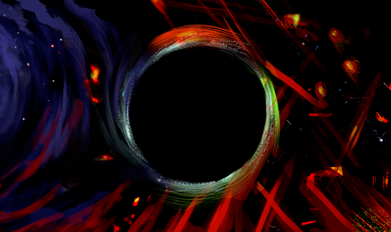
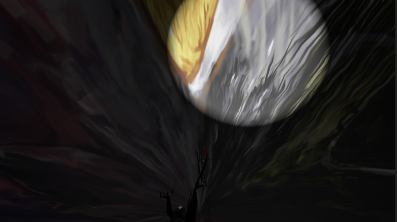
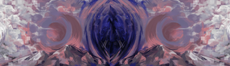
To mirror Caitlin’s graphic concepts from earlier I wanted to have the center of the background to always be a circle framing the tree as it was such a striking image. Combining this with the idea of transition I chose to explore the idea of a lunar cycle. I divided the cycle into five stages, with the environments surrounding becoming more abstract and removed from nature as they progressed.
The final scroll above! It’s a shame it had to be dropped in production, because I was really happy with the final outcome. But I guess C’est la vie.
Artist Reference; forests, woodland environments, something faded, yet distinctly wooden and overcome by natural formation, overgrown.
Something most mystical, lifting up into the clouds, moving from realism and hinting at something more abstract. Clouds, pixels beginning the transition. Moving into colour and a rise in technology.
A shadow of a moon, hidden. Something more subtle, a representation, a silhouette. Transition into night, into darkness. An outline, moving into mountains, into the sky.
More spacial but still based on ground level i.e. the Earth. Rooted but travelling upwards, into night, into darkness. Sharp fade transition from earlier benign dusky pink skies. Hinting at something to come. Ominous.
A sharp final silhouette. Chaotic, powerful. Striking colour schemes. Edges and sparks, indication of disaster. Complete removal from nature or natural indicators. Abstraction, no sense of gravity.
When we decided to change the background away from the scroll (which would be overall irrelevant to our revised meanings of visual communication) we opted for a background still. I was stubborn in that I wanted a small piece of my work to be used and tried to find a texture by cropping a section of my background painting.
Looked horrible on a sphere! Blehhh
It worked nicely as a visual against our tree, especially when it was lit well and reflected with it’s blinn material. However it was pretty distracting, maybe I was too focused on having a little bit of my work to feature somehow in creating the atmosphere for the shot that I wasn’t seeing sense.
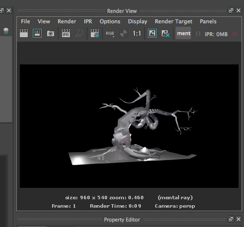
(The test renders came out maaaaaaaaad the first time!! Up above were the test renders we went with for the First Cut. We didn’t want to rely on AfterEffects to desaturate the whole scene so I edited the original texture by adjusting the saturation and brightness & contrast in Photoshop.)
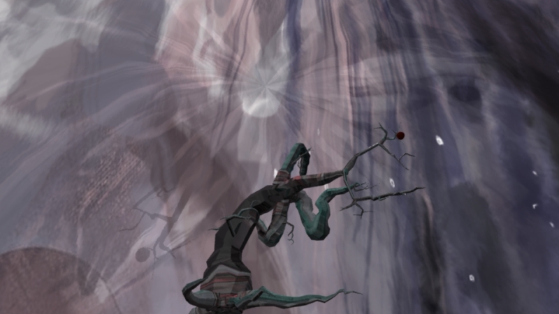
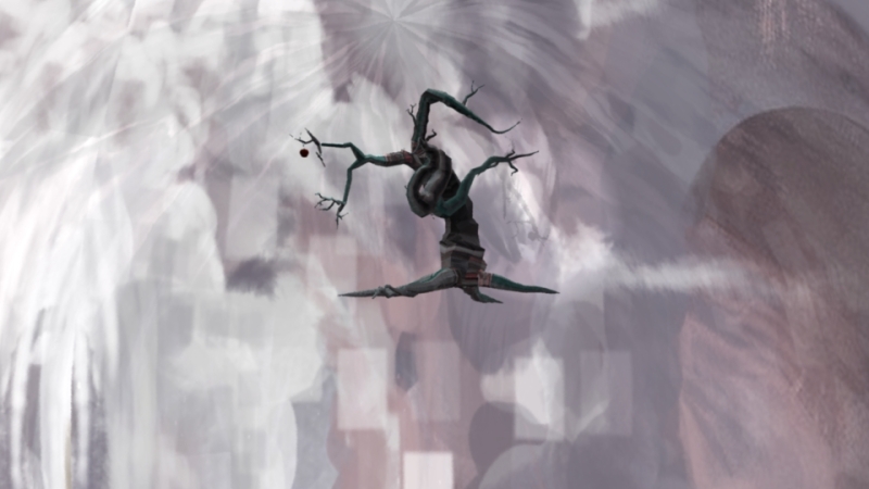
I had been trying to texture the tree and finally learnt my way around Hypershade! So even though my early texture tests weren’t used, we all agree to try and apple a texture image to the tree! (I really like the lowest tree colouration! Though it didn’t quite fit the desaturated navy-green x deep pink is pretty nice. Used a spotlight to test a silhouette like a moon shape.)
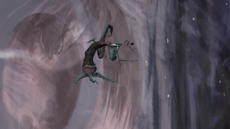
Caitlin produced a number of really interesting and striking visuals during our conceptualisation phase, and this one below really complemented the low-poly structure of the tree, especially with the blinn texture!!
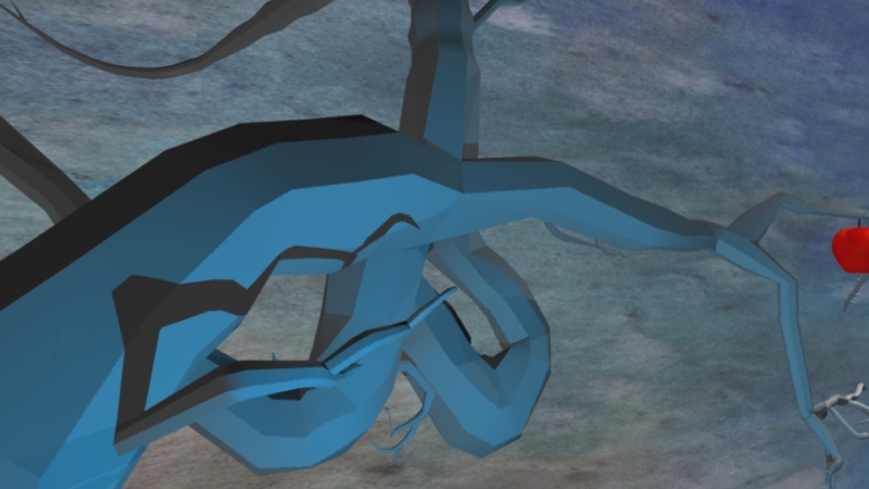
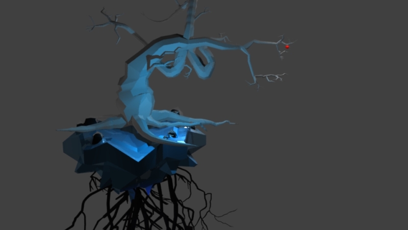
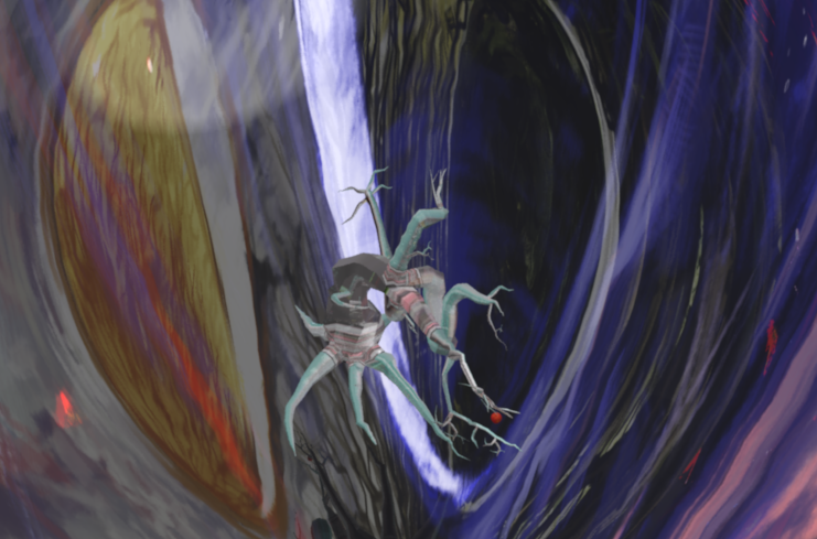
Roots were powerfully symbolic in our animation, and we wanted to harken back to an early concept graphic – a collaboration between Caitlin and Eoin, showing the tree and revealing it to be mysterious and unnatural, uprooted and exposed!
As Eoin was modelling the tree I asked to model the ‘base’ and the exposed roots, I based the roots off a very particular graphic so they were sort of limited.
Though Eoin when combining the tree with the roots took my base and made it pretty sexy with loads of extra entangled roots, it was a good call it really improved my model and provided an awesome juxtaposition with the low poly crooked tree up above.
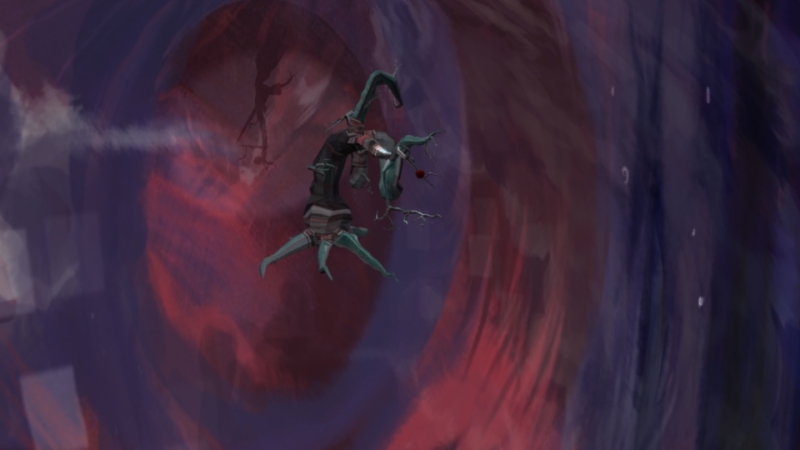
Now to animating scenes! Once our scene was set up, tree and roots modeled and background lit successfully, we could fire on with making the scene visually interesting. Lack of a developed storyboard and 3D animatic made it crazy, everybody was trying to do something mad visually so when it was edited together finally it became a clusterfuck of dissimilar ideas and widely different styles (tbh!! tho) I went off the rails and wanted to transition from within to outside the apple with a helix animation of spinning gears. My first scene is shown at the very start of this blogpost, made using Jonny’s awesome gear and apple models!
For the helix motion, I was originally trying to delete all bar one edge of a preset helix model and to set a motion path, until I realised that I’m a huge idiot who had no idea what she was doing. SO! Back up animation plan, move each individual gears animation pivot to the center of the apple, rotate animation and scale downwards to get the look!
And then our final animation! Well, the original cut. The director’s cut. The cut made by a group of four people who just want to be DONE. FINITO.
But nahhhh, we rushed our editing, and edited on separate computers in separate locations! Bound for disaster. When we spliced it together we tried to make adjustment cuts throughout the latter scenes to maintain some kind of stylistic middleground throughout, made it all the madder, but our first go at Malum still has a lot of charm to it, in my opinion! x
Thinking more into the development of what our city could be, or what it could represent I researched into the Iliad, the classical masterpiece from the epic poet Virgil detailing the quest of Aeneas in founding Ilium – i.e. what would become the Roman Empire. Aeneas is a prince of Ancient Troy who survives the fall of the city, driven by a destiny set upon him by the Gods to found a new Empire in a foreign land. The story of Ancient Troy follows themes of wrath, power and glory, homecoming and fate – it was a story that originated from a society that idolised heroism and applauded violence. These themes were something I thought could successfully be incorporated into the overall ambience of our city. The thematic relevance of fire in the downfall of Ancient Troy is reflected in our city but by modern day standards – fire could have a devastating impact on ancient cities of this period due to housing structure, in modern times an equivalent to this destructive force on contemporary cities would be the impact of nuclear weaponry and radiation. This is in conjunction to inspiration from other fictional cities, such as the Commonwealth functioning society in Fallout 4.
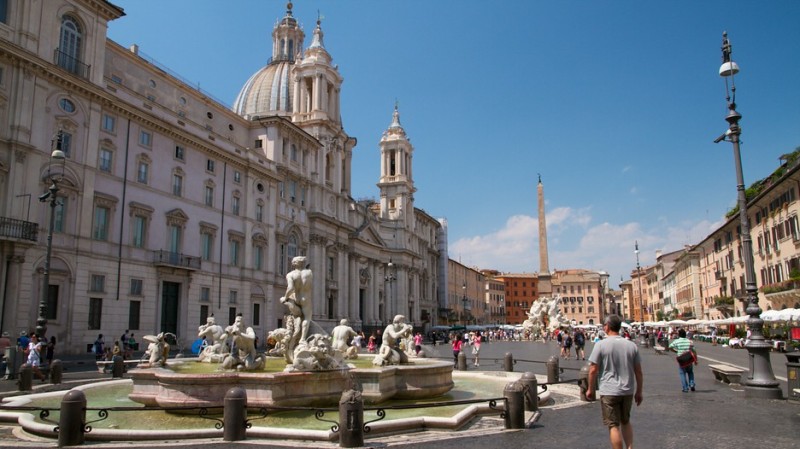
(Piazza Navona – Baroque period Architecture;
Architect – Apollodorus of Damascus)
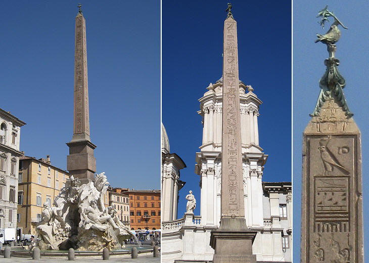
(Fontana dei Quattro Fiumi (Fountain of the Four Rivers) topped with Roman Obelisk
Obelisk of Domitian)
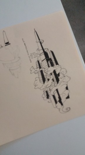
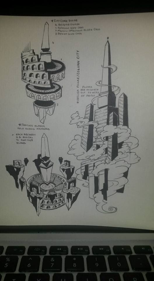
The obelisk was erected by Emperor Domitan after the fire which had destroyed a large part of Rome in 80 AD, a historical context that was fitting to the narrative of our city, an alternative disaster causes the erecting of a grand Obelisk. Obelisks arose from Ancient Egypt originally, they were believed to point to the Heavens, and are deeply associated with the Sun god Ra – basically Egypt’s equivalent of bird Jesus. The Obelisk would serve as a spiritual center to our city. It would also reflect modern feats of architecture, such as a sky scraper. Ancient cities were built around a citadel, the highest and safest point in a city. There was a clear distribution of wealth in Ancient Cities with the richest living in the Citadel.
The economic situation we wanted to attain in our fictional city was one of high contrast, there is a very wide division of income, with the wealthier “Patrician” portion of the society hoarding supplies and riches away from the “Pleibeian” working and low income classes.
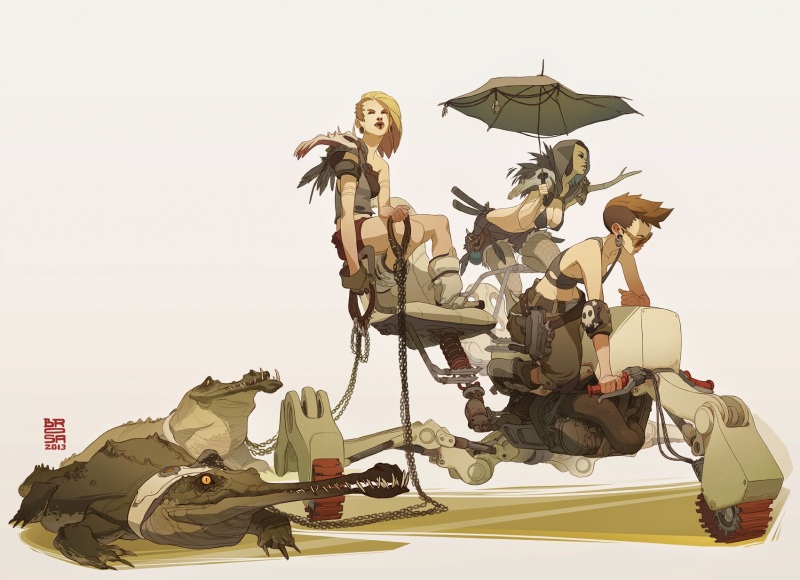
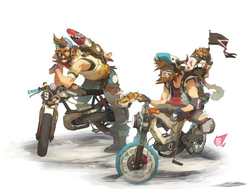
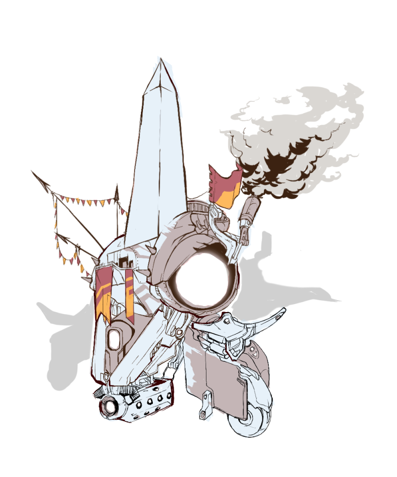
Based off these early designs for our obelisk I designed our final center Obelisk. As well as being our religious point of worship for the city it represents the wealthiest point and a power source of electricity (as this is what is actually powering the city and suspending it in the air, i.e. a source of security and safety.) When designing our Obelisk I was heavily influenced by the work of Sergi Brosa, a concept artist who was involved in a game development project known as Atomic Delivery. I found his overall ability to create such a vibrant yet dystopian world was phenomenal, as well as his attention to detail. Here were some of the pieces that I was particularly influenced by in terms of stylising our city.
The biker aesthetic and overall sense of patched together clothing and mechanics was really appealing and original in it’s execution. Applying this technique to our Obelisk design, and overall city was ambitious but it would add to a strong end result, something that implies a once existing or lost magnificence and sense of grandeur, yet still maintains a shadow of order underneath present circumstances of disorder.
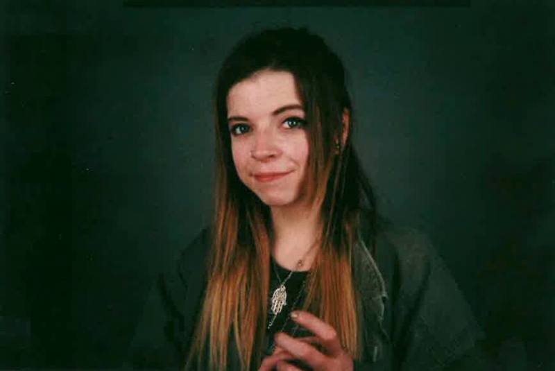
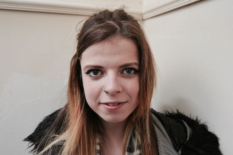
A good proportion of my head model research was based around looking at my own face. It’s this kind of project that keeps me going, one that appeals to my vanity.
Cue excuse for me having my picture taken. Because I really needed one.
(shout out Sinead McCormack; always capturing my face at cringey angles hahaha)
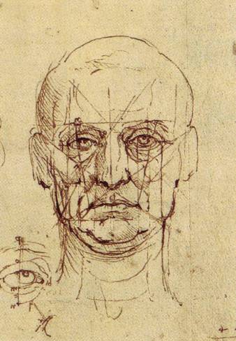
This project was doubly great in that it allowed me to delve into classical art research as well. Which appeals to my innermost non-animation based self, obviously. (Leonardo Davinci, frontal face study, face lining reference)
Something that I really wanted to capture in my head model was the look of a Renaissance marble sculpture, there was a stage in which I intended to carve out pupil edges and model low poly hair as well. Until I realised that I would be a victim of my own mad ambition and decided to do what I could in this style. Largely the reason I modelled my face with an open mouth, to give it most of the relaxed jaw you see in these statues.
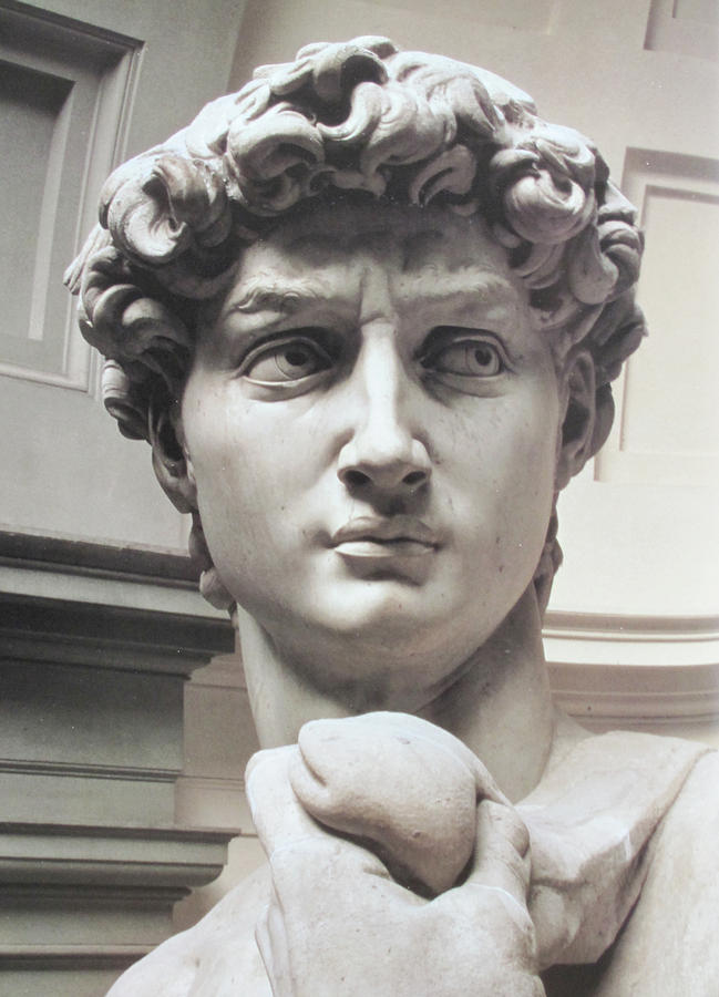
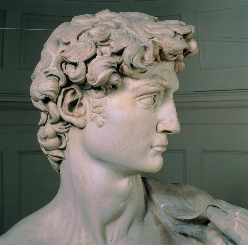
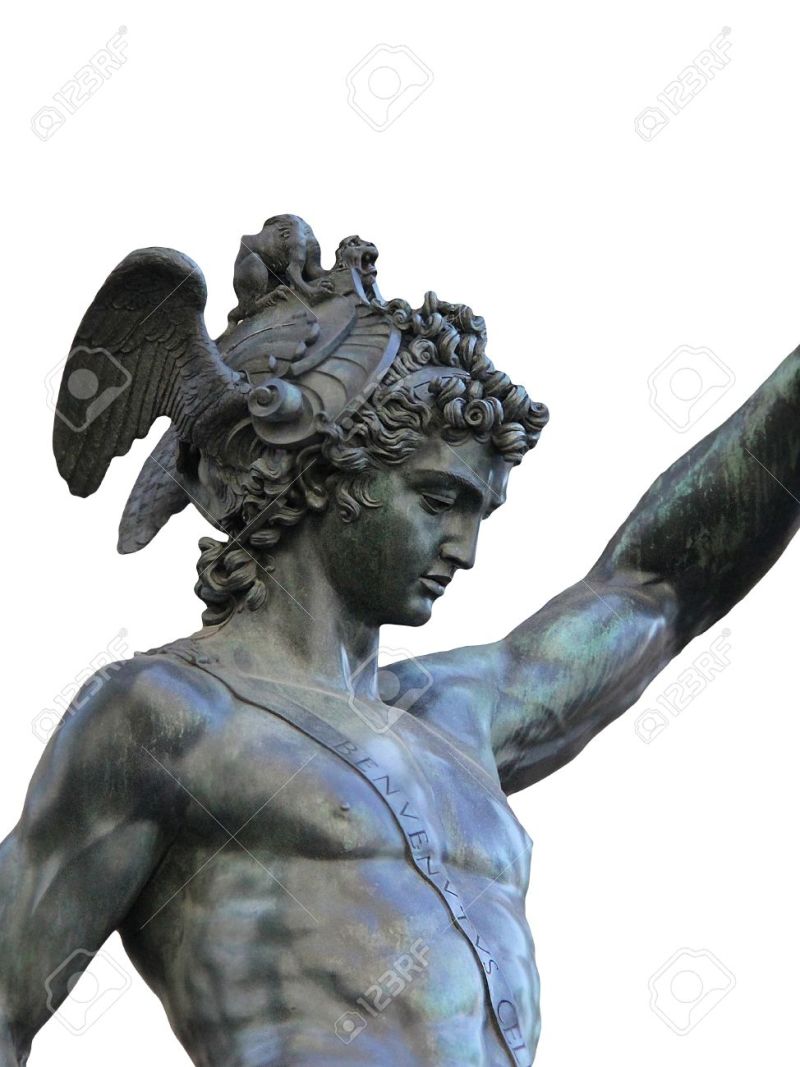
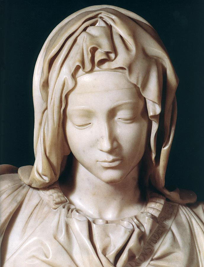
Michelangelo’s David is a classic example of a facial sculpture, although the anatomy is exaggerated in points comparatively to a real human face, it works and is held together correctly within itself. Although not sculpted by Michelangelo I referenced once of my favourite sculptures of all time, Benvenuto Cellini’s bronze masterpiece Perseus With The Head of Medusa, who himself was highly influenced by Michelangelo. To reference a female face specifically I was looking at how Michelangelo captured the delicacy of her nature in Mary’s face in his Pieta. Thought the Michelangelo style faces are characterised by their delicate feminine quality as an almost universal feature, the beards on men are what captures their masculinity.
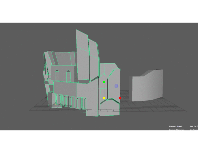
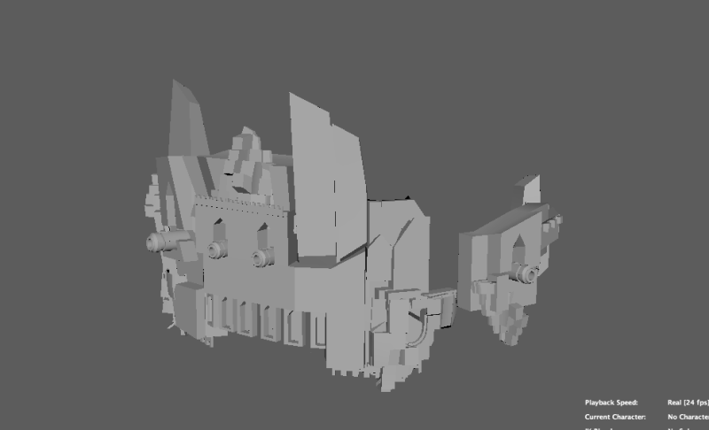
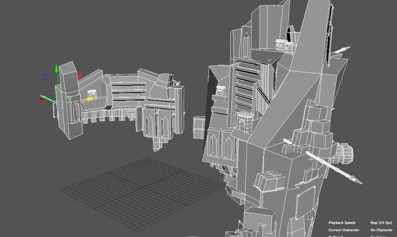
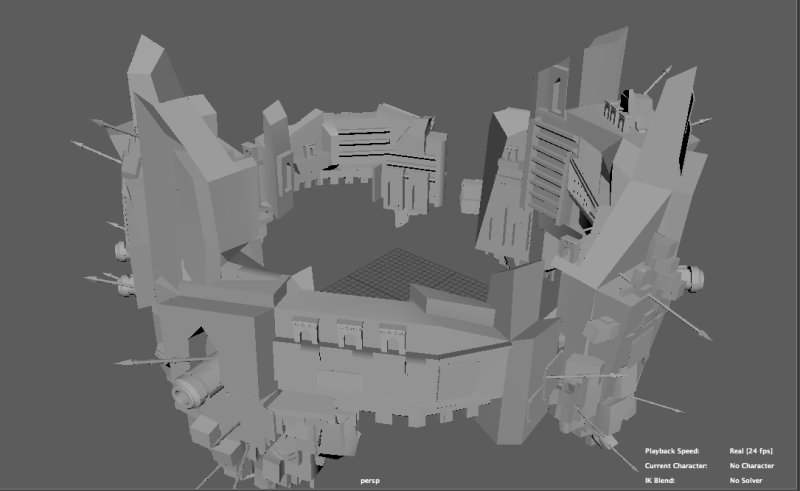
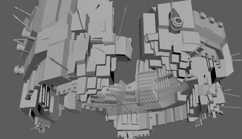
Based off earlier sketches of our city in my sketchbook, I planned a final silhouette of our city so that we would be able to begin the modelling process. From the beginning I wanted the city design to be well established by the point we came to modelling so that the team would be working in some kind of synchronised pattern and we would all be working towards to achieve the same overall aesthetic. The city plan I drew wasn’t overly detailed, it was meant to be extremely detailed in certain portions (stylistically it was technical in patches – representing perhaps economic discrepancy within buildings, as some could afford external defense while others cannot.) Overall the plan was meant to capture the shape of the buildings and their disjointed architectural style while also establishing the distance between “islands” in the floating city.
The design in based off of a Roman Colosseum, with the centre piece being the “powersource” Obelisk. The city is war torn and defends this Obelisk from presumably floating invaders or malignant forces with its armoured walls. We aimed for a city silhouette that was highly asymmetrical, reflecting the disorder and chaos from which the city itself originated. Roman Architecture is highly organised, buildings are served to further the order of the city, and it was pioneering in most famously road building, but also in transport and work. All these architectural breakthroughs emerged on the back of a rising empire that could invest it’s wealth in funding proper architecture. For this reason, the asymmetrical semi-ruined state of our city was an appealing concept, it juxtaposes the architectural order of Ancient Rome with an external presence of sheer anarchy.
I provided my team with several edits of my earlier design, just to clarify the design.
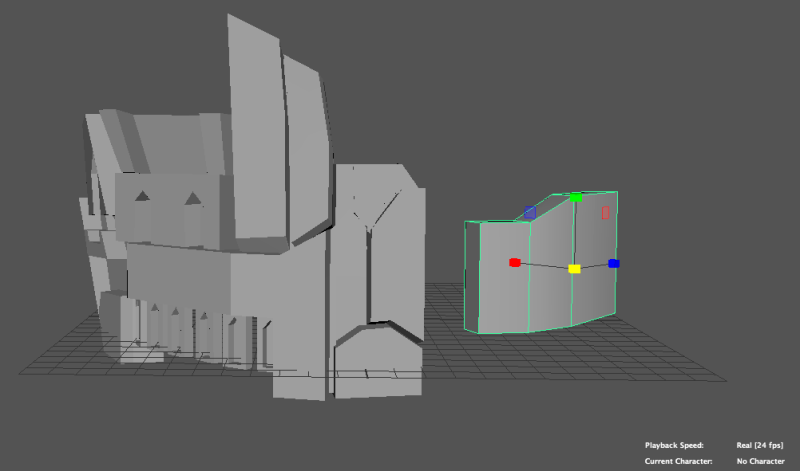
Our floating city design was sectioned off into parts which made it easier to divide our efforts and workload between the team. Jakub had already experimented before the design had been finalised and created our gorgeous final Obelisk, although it differed slightly from the design on the design page. That left the sections of the “fortress walls” (upper walls), the “arena”(middle center island), the “engine”(the lower island) and the “lower defensive walls” to be modelled. I chose to piece together the upper fortress walls,as I had a fair idea of which way I wanted to take it.
Jakub had designed in his lower defensive walls certain assets such as spears and canons and to minimise unnecessary workload we decided to patch the same models to build onto the upper fortress walls – keeping them stylistically relevant to the rest of the city.
This was my first venture into a more detailed model so it was quite a harrowing experience to say the least. Our designs are limited in the beginning stages because we’re not aware of what we’re actually capable of. I made my start by splitting a pipe shape and deleting the half of it I wasn’t doing to be using. To form something similar to our concept drawings was simple enough, it only involved extruding and building detail on faces to represent a difference in building. The walls were then embellished to include detail such as clusters of chaotic rock extrusions and other details, the window carvings and balconies, representing the areas of the walls affected by the clash of rich and poor respectively.
I wanted to add internal detail to our city as well, to expose the weaker underbelly were the most vulnerable civilians lived. Housing was large and clustered in the carved out internal “windows” in the wall details, and the internal walls at the same time host wide open balcony stretches. This was designed to reflect the Roman importance of the Piazza, an city design mindset that values open spaces for social needs, with room for forums or markets, or simply gathering areas away from the homes.
After I modelled one large wall and a smaller defensive wall I duplicated the two and merged them into one large wall. This filled up the remaining section to complete of the arena. Following this it was just a case of adding extra detail and embellishments to our walls.
Our final project came together in the end, our whole model pieced together, alongside various textures and background took a long time to render, despite it being only a simple animation 360 degree model turnaround.
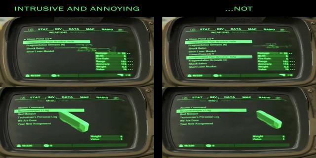
For the data visualisation aspect of editing I had intentions of creating something that was highly reminiscent of Fallout 4’s retro interface;
Although our time management should have allowed a larger editing budget in reflection, our ambitions were pretty high for what we wanted to achieve with a limited knowledge of AfterEffects.However we pulled off a kind of retro text in the end, and we were able to “draw lines” to section off our city in order to reflect the division of wealth that we had in mind from the beginning.
In this post I have a full overview and series of screenshots explaining my approach to tackling the Maya head model. Though it wasn’t necessarily how others went about their research I was convinced that I would approach this like a classical sculpture. That was my intention for my finished model, which kept the process interesting for me.
(Classical art memes providing head model references as well as sound life advice.)
After researching methods of how to construct a head I narrowed down the two main approaches, which appear to be modelling from a cube or plane (/patch) modelling. The cubist approach was to take a cube and to manipulate the shapes with edge loops whereas plane modelling involves working outwards by starting on one small portion of the face and building detail by extruding edges and forming your own shape. Both methods are daunting when you think about the high amount of detail in a face – and my goal at the end of this project was to create a face that reflected human detail but didn’t cross into something of an uncanny valley effect, in that it was borderline creepy.
(internal thoughts; “i have so much fucking work to do literall y kill me”)
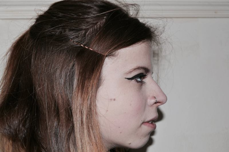
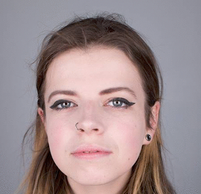
Beginnings! Caitlin (Collins re;up) took my starting topology photos for me to work with. These were great, the quality of her photography and the strong lighting provided me with a strong silhouette to shape my face. Poor planning on my part meant that I forgot to brush my hair out of my face in these photos, so my neck and ears are covered in hair. Modelling said hair wasn’t really an option, so a little into starting I knew I’d need to source some more topology photos with fuller coverage. Though these were really useful, and taking our own topology photos meant I could get an earlier start on the modelling.
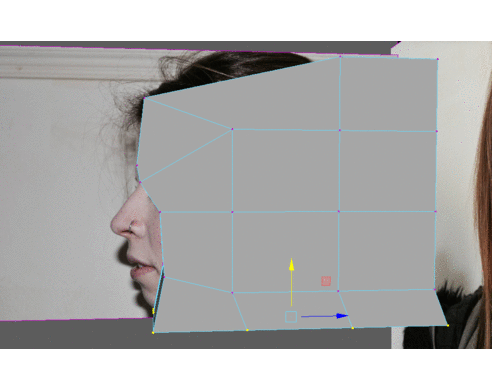
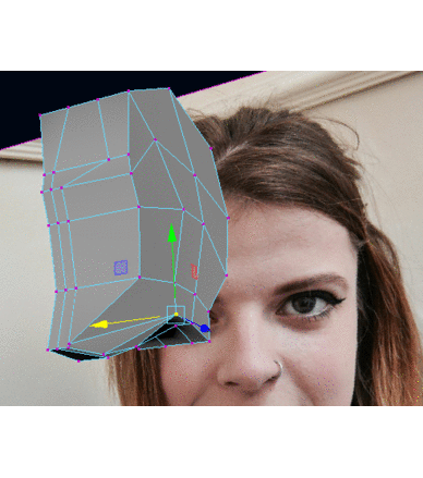
I went down the route of box modelling from a tutorial. The process involves using a simple cube polygon and inserting a number of edge loops to the necessary points to form the beginnings of a facial shape. To start it was working with the least amount of edge loops as I possibly could to avoid me confusing myself, and we try to establish a face shape! At this point I was reassured a little in my ability to complete this project because I had created a template to work on.
I had started this at a point where not too many others had begun their head models, so there wasn’t too many opportunities for comparison. Though on reflection next time I’ll have to properly line up my reference images to make for a more accurate model, basically I was using these images as more of a rough guideline because I knew I’d have to retake them anyway. I box modelled half the face and the plan was to duplicate it over once I had a solid template to work on both sides, though on reflection I could have worked by mirroring geometry but at the same time I wanted to duplicate just before I finished up adjustments so there would be a solid level of asymmetry to match my asymmetrical face.
If all else fails I had a back up plan of pulling an Elephant Man and hiding my disgusting head model with a sack.
Genius. I know.
Next came a start on my mouth and eyes. For whatever reason I decided to smirk in my front reference photo so I was left with an inaccurate face shape, so I deleted faces around a slit in the lip area to give myself an open mouth.At this stage I was still careful with my edge loops, trying not to make too many in case I misplaced them. Which I realise now isn’t as much of a big deal as I made out! I would later rearrange the vertices and delete edges around the eye to change the shape.
Now that I had the lips and eyes to work with I dove into creating the nose shape. Following issues with not lining up my image planes correcting I realised that my facial anatomy was off because I was trying to mold the face around two different views. This was particularly evident in that my lips and mouth hung way too low down the face. At this stage too I was taking the time to correct errors and define the shape of my eyes and brow. Nose was pretty easy to tackle comparatively after modelling the lips, if I could do it again I’d take the stages in the same order.
Face > Cheeks > Lips > Eye > Nose/Brow
My first go at the eyes would’ve been perfect if I’d been modelling myself as some freaky bloodhound hybrid person, unfortunately, my real eyes aren’t this droopy.
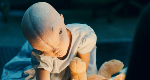
Tests! I wanted to see how my face would look pieced together as a whole, and also I wanted to see how my eyes would look with an actual ‘eyeball’ i.e. a sphere polygon. The completely symmetrical face was really creepy and a lot more changes would have to be made, but this was a positive realisation as it would give me more room to model the asymmetrical features of my face. The sphere as an eyeball didn’t cut it on its own, the eyeball itself anatomically takes up about 80/90% of the eye space but in the negative eye space there’s bits of pink flesh. Negative space! I wanted to fill this detail in, what I did was select the loop of edges in the eye hole, move them backwards and scale them inwards, and then filling the mesh hole with a face. I used this technique to model my nostril holes too.
Now down to details! With the back of my eye made I was able to scale the sphere to a realistic size and fit it in in proportion to my eye socket. I have strangely large big real life anime eyes, I don’t know how I feel about it. I was tempted to push more eye detail at this point, capturing those bags under my eyes! But decided to leave it for the time being because they are very asymmetrical and I could do a better job of it later. I duplicated my face over and began to merge vertices to form a whole shape. My face model at this point looked like some strange shark creature because of the topology in the points where it combined at the forehead. I combined and smoothed those vertices, trying to readjust my face so it didn’t match up like a mirror image.
Also a lighting test! Lights were a useful tool, because it gave a different point of view on the model, I experimented with different light intensities to see the effect it had on my face model. It was useful to pinpoint little errors that your eye would catch when looking at a realistically lit object. There was also a beginning to ear modelling, an approach in plane modelling.
I
(See below; my face when I mirror my face and start combining head vertices willy nilly.)
Something annoying happened halfway through my modelling process, the tutorial I was following got deleted an hour and ten minutes in. I was left at an impasse; start from scratch or try and power through. With pressure building I made the decision to combine tutorials and pick up a plane modelling extrude approach to build my ears and then attach them to my head model.
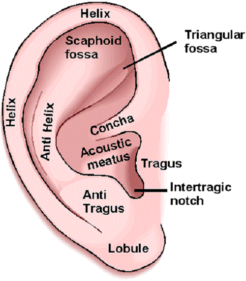
I went ahead with the back up plan and fired on through. I was actually really excited to start modelling the ears, with all their flaps and gross folds it’s an interesting and complex surface to try and replicate. I built the shapes in side view and then filled in mesh holes with plane faces. Then I would click on the edges in the Helix and pull them out so that there was a defined depth to create the scaphoid fossa. I extruded into the back of the ear to create further depth, pulling the extruded edges inward and scaling them down and filling the hole to create the Acoustic meatus and then the Intertragic notch. When attaching my ears to my head I simplified the topology of the ears by deleting the unnecessary faces. I also tried to model my stretchers with a pipe shape like an idiot but later decided against these because they aren’t big enough to effect the overall shape of my ears.
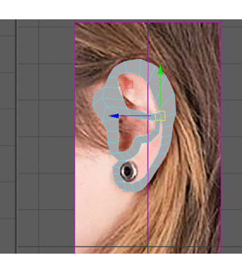
Ears! I had Conann’s topology photos to work with as a reference here, different facial angles and my frontal photo was a little askew but I had good material to work with here. And that’s me talking from a professional perspective I’m not just flattering myself.
(Also this apparently.)
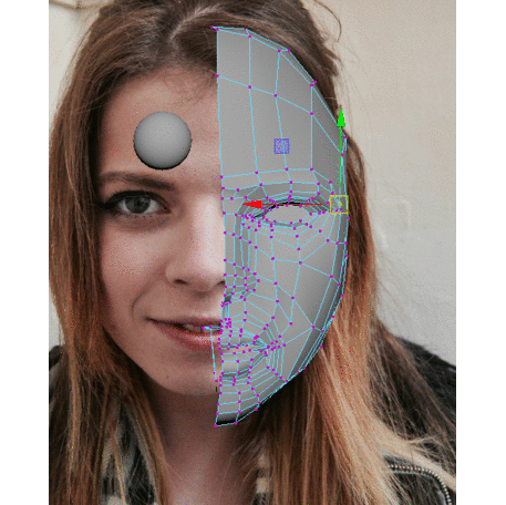
I was more careful about lining up my photos! And used the side and front view correctly on the second time round to really nail my placement. I used these photos to accurate place my ears and also to fix the shape of my neck. Adjustments had to be made especially in the frontal view of my face in order to get my cheeks shaped correctly. What I’ve learned! Frontal view from the perspective, or what you think is the frontal view, is often inaccurate to what your actual frontal view is, so it’s very worthwhile to look from the actual front view and correct accordingly.
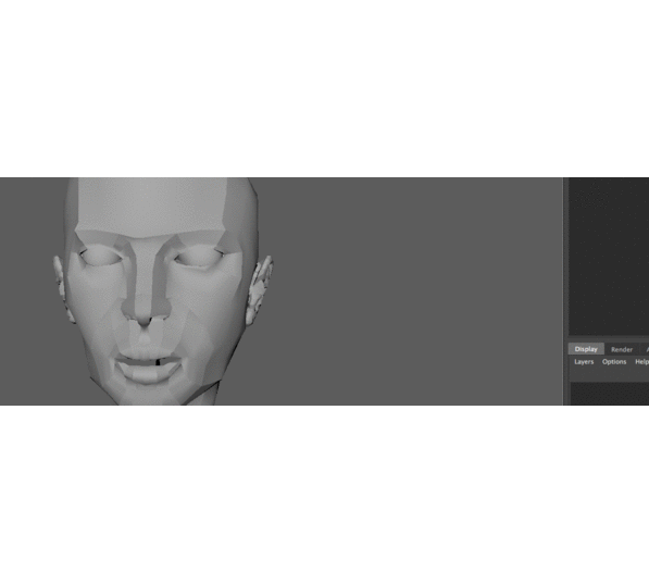
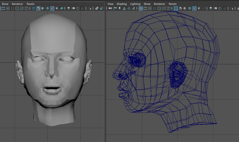
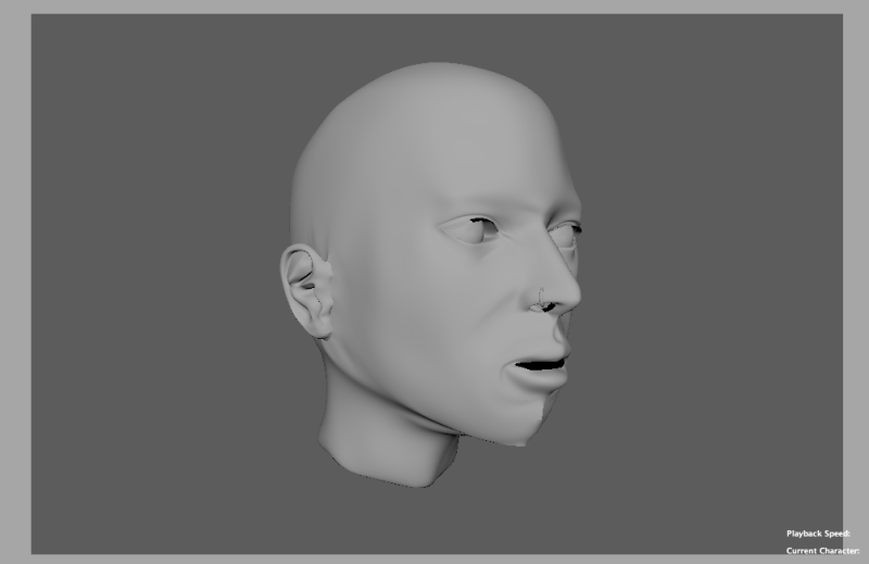
And here we are finishing touches and topology overview! Once I had identified the placement of the ears I cut up the faces I planned to attach them to with the multicut tool. I then merged the vertices so that the ears attached, all the while I was looking at my own ears to work out at exactly what point in the lobes they detached from my head. I added details to my eyes by adding a little more depth, the bags under my eyes are sadly the most spot on aspect of this model. Blame the existence of this head model task for that, I guess, no hate though. More asymmetrical features! Also my nose ring is a must, my head model became slightly more edgier for that, it was just a pipe shape scaled down and reshaped and then combined with the rest of the model. Voila.
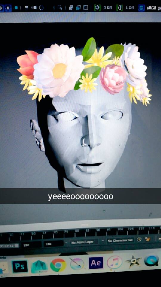
Final Head Model;
Softened View – I’m not satisfied with the softened final outcome as I can pick out a lot more errors and points that need corrected, but I may revisit her and fix the errors later on once I’ve a bit more time to play with!
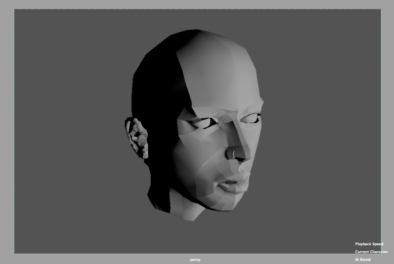
360 Model Turn-Arounds (Various Views)
300 Word Evaluation
Overall I enjoyed the process of researching, experimenting and creating this final head model. It was an experience that I learnt a lot of different techniques from, and while it was challenging, I’m glad that I gave myself enough time in order to enjoy the process and reflect on what I was doing and what the next best step would be, rather than rush through the piece and limit my time for learning on reflection on what I was doing. I’m glad that there was a certain level of artistic liberty that I could take during this task to keep it all the more interesting for myself during production. Research into sculpture was enjoyable and insightful, and it took me back to my roots of wanting to be able to replicate classical artworks.
As something of a portraiture artist, I was aware going into this task that the face is deceptive in how much detail it hides. Towards the end I had to remind myself that I needed to prioritise time on other tasks and tear myself away from the project because it was so easy to just get lost in trying to capture every minuscule detail and nuance of my face. If I was to complete the task again it would be so much easier now that I’ve learned as much as I have from the process, but I would also spread production over a greater length of time in order to allow room for error, or in case I wanted to redo a portion I would have that option available. However, saying that I would happily do another face model in order to chart my progress and how I’ve improved over the course of this task. Rewarding would probably be a good word to describe it, and I just hope that with practice I can retain the skills and knowledge that I have gained through the process.
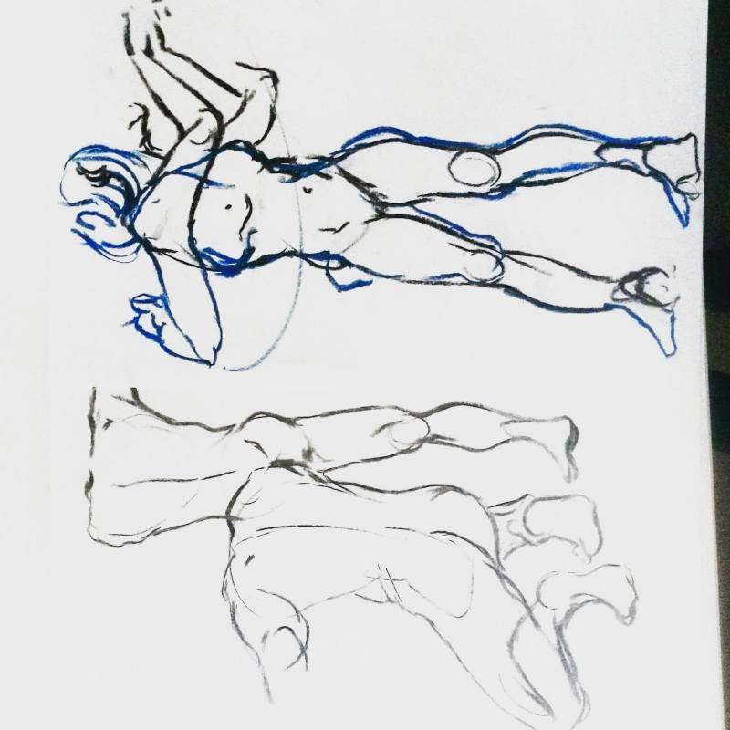
The drawings I chose to use as part of this reflective statement on the development of my life drawing over the past two semesters was from the lesson focusing on capturing motion in character arcs. Of all our classes this semester, I found this one to be the most enjoyable. The exercise involved the female model, Jackie, moving in between various poses while keeping her feet planted in the same position. She would cycle between a series of poses such as bending down to reach or throwing an object.
On the first pose we drew the model posed as they were, full body, and in the following poses we would draw changes in her pose as she moved. The upper drawings, of Jackie in a black charcoal initial drawing and a following changed pose drawing in blue pastel, were my personal favourites from the class. Especially in the arc showing the movement between the arm movements in a swing, I find that it captures the energy and flow of a movement. It was also interesting to me to study the subtle changes in stance and anatomy as the weight shifted in the upper arms as the model moved. Her feet slightly changed position, just to adjust to the change in her body weight. This exercise was a refreshing change to earlier classes, it was a throwback to when I was drawing animation frame by frame early in my early animation days.
The lower two drawings of Robert, the male model, were taken from earlier that same lesson. As a warm up Mike had us draw 15 – 30 sec0und quick gesture poses before starting onto the main character arcs portion of the class. During Life Drawing, I take it as an opportunity to improve my understanding of human anatomy and ability to draw from sight as quickly as possible. I struggle when Mike gives us very specific tasks to focus on one aspect of the drawing process, such as weight, scale or perspective, to ignore other aspects of the drawing. It’s caused a minor block of sorts in some of the Life Drawing class where I don’t feel as if I can communicate that I understand a drawing concept because of the nature of time limited drawing.
Despite frustration, I do enjoy life drawing as a whole, it’s a rewarding experience to have in that it challenges your ability to portray a pose with correct anatomy within a time limit. I don’t know if it has improved my ability to draw faster, I can draw quickly during the Life Drawing time limit but back when I’m drawing normally without being timed I sneak back into my old habits. Speed drawing techniques don’t necessarily translate over when I’m drawing normally.
Over the past couple of weeks as a group we have been discussing possible outcomes for our 15 second animation, the brief given to us was “Hard and Soft” but my suspicions were that the design brief was more of a starting point to develop our ideas from, rather than limitations. Until this was confirmed, our concepts may have been limited to something more confined that would “answer” the brief – I’m glad we’ve got past that point in our thinking. I’m excited and motivated to work with this group, I’m sensing opportunities to learn from my teammates and be inspired to work how they work, all of them being extremely talented in visual development, and to expand my creative skillset as a result.
A goal in this project following feedback is to be able to communicate my ideas more coherently so that they are understood and incorporated more accurately. I get the impression a lot of the time that my ideas are bounced off of walls and ignored because they are misunderstood. Oftentimes I don’t attach too much sentimentality to an idea because I am past a point of putting too much self-importance in an individual idea’s success, but if I could become more organised in my communication ability it would decrease the mortality rate of some (dare I say) sick fine art philosophical ideas and questions at their conception.
As a team our initial brainstorming session was based around what we wanted to achieve visually. I got an affirmed impression that our priority was to create something that will be visually spectacular; but what we all agreed we found difficult was establishing a fitting narrative. Fifteen seconds is a limited period of time to successfully communicate a functional story, and our problem is we don’t just want a simple “character moves point A to point B, character eats food or makes a friend whatever etc insert bullshit cliche here” kind of “””””story”””””” but something more interesting, deeper, with an underlying meaning. If our fifteen second animation can resonate with the viewer after it has finished, for it’s narrative before it’s visuals, then we have succeeded as storytellers (though, I am not planning for these visuals to look in any way sub-par, the goal is resonating storyline alongside killer visuals.)
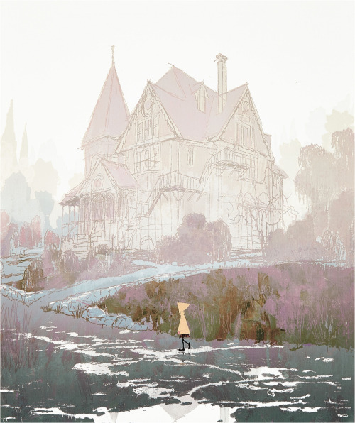
Coraline (2009) / Michel Breton, Concept Art
Prior to our initial team meeting, I had gathered some abstract visual images to use as a personal reference, and I’ll now go over the response from my team members, which was used as a tool to figure out what we were unanimously interested in and what visual elements we could all be inspired by. The pieces of concept art used in the visual development of the 2009 stop-motion claymation film Coraline (directed by Henry Sellick), digitals paintings by Michel Bretion and Tadahiro Uesugi respectively, got a good response from the group. The stylisation of the trees really seemed to appeal to the group, their gangling awkward design creates a sense of uneasiness which we could apply to Jonny’s narrative idea of a Memory Tree. A tree that captures and represents elements of the past, with memories represented in glowing orbs hanging from the branches. The pastel colouration in these concept pieces also generated a positive response from the group, the contrast in the character’s colour scheme against the muted background is striking yet subtle, giving the pieces a highly appealing aesthetic.
TADAHIRO UESUGI
Coraline Vis Dev
Digital
I had looked into the upcoming claymation film from Laika studios, who had also produced Coraline, for visual inspiration and was interested in creating a character to fit an origami-theme. I had a crow character specifically in mind, but once again not much of an idea but a vague visual concept, it was for the most part overlooked. (Not ignored! Just didn’t make the final four.)
Tubo and the Two Strings – Laika Studios
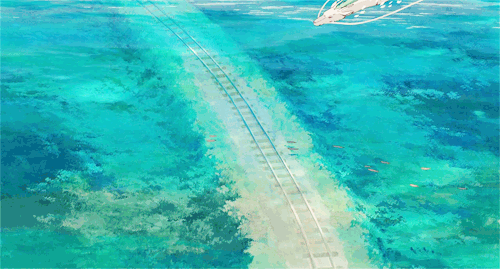
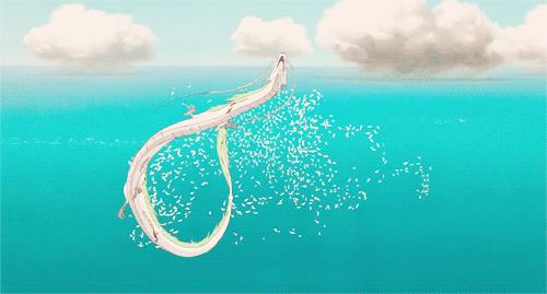
My research at this point I gather was steered in a completely abstract direction, I wasn’t really interested in figuring out a narrative on my own, because besides that being completely intimidating it would probably had little chance of survival through our group meetings – mortality rate of narratives is very very high. So I began picturing characters to animate, we had mentioned the idea of doing an underwater theme and I pictured a serpentine creature shedding it’s scales over the course of the animation, the narrative of the animation being centred on the idea of transition. As a visual reference scenes of the character Haku from Studio Ghibli’s Spirited Away came to mind. The idea of a serpentine character I think went well, but the research I had to show was very far removed from the styles anybody in my group had in mind, I think. Though I like the shedding scales visual, the scales break off and form strange patterns in a trail following the serpentine character; I like the visual and may follow through with this in another project.
Spirited Away – Haku Character gifs. Hayao Miyazaki – Studio Ghibli
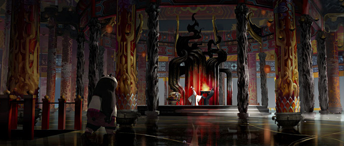
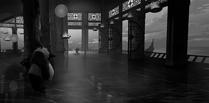
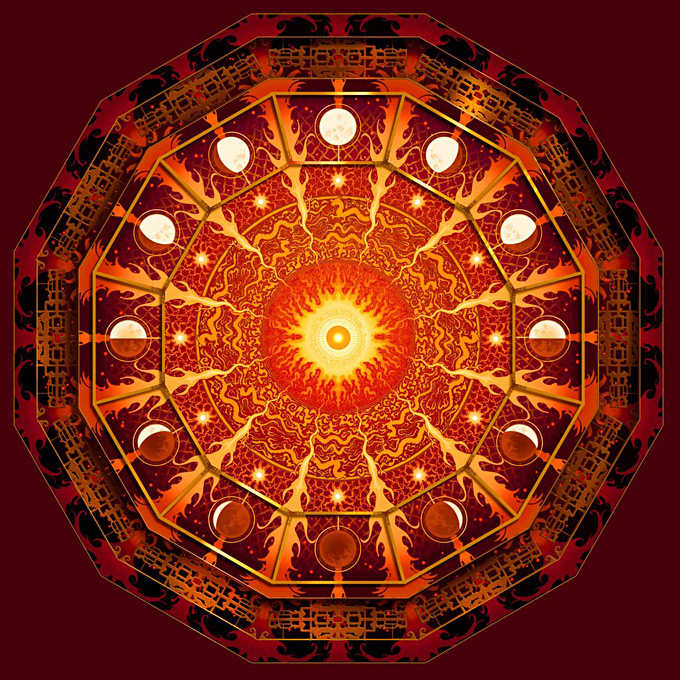
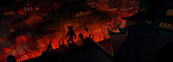
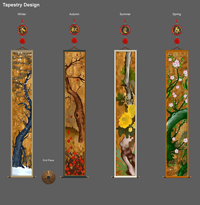
My intention was to create a resource of idea images to forward the discussion, although it might seem like a case of the old electric boogaloo disney sequel, Kung Fu Panda 2 both with its strong narrative and visual execution goes beyond the stereotypes of an animated kid’s movie cliche. I showed them a selection of concept art pieces from Visual development artist Mike Yamada that he created for DreamWorks Animation’s Kung Fu Panda 2. Mike worked on creating colour keys, environments, props and tapestry designs. I loved the intensity of the contrasting colour schemes and thought that these could be applied to unnatural underwater settings. Vibrant reds lighting an underwater scene from below creates such a surreal aesthetic and would be the perfect foundation environment to spin a dark fantasy based narrative.
I also felt really inspired in the variety of environments presented in this indie game trailer, for Oxenfree by Night School Studio, it’s a 2D platformer horror game that features just such a range of varied gorgeous background environments with a stylistic common denominator.
Our goal first and foremost is to create something that is visually appealing to us, so much of our research time at this point had been spent trying to discover what we were interested in. This causes a working-backwards notion when we’re putting the emphasis on visuals before narrative, but the idea was to piece together visual concepts we were interested in and then finding our narrative from within that.
 ning the fundamentals of effects that may not even work in the end. It’s all a matter of which risks are worthwhile.
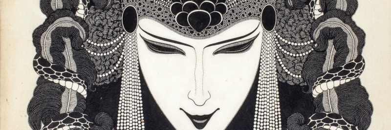
 ides another thing, we always want to see what is hidden by what we see.”
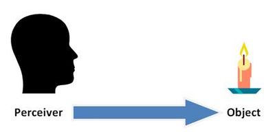


")
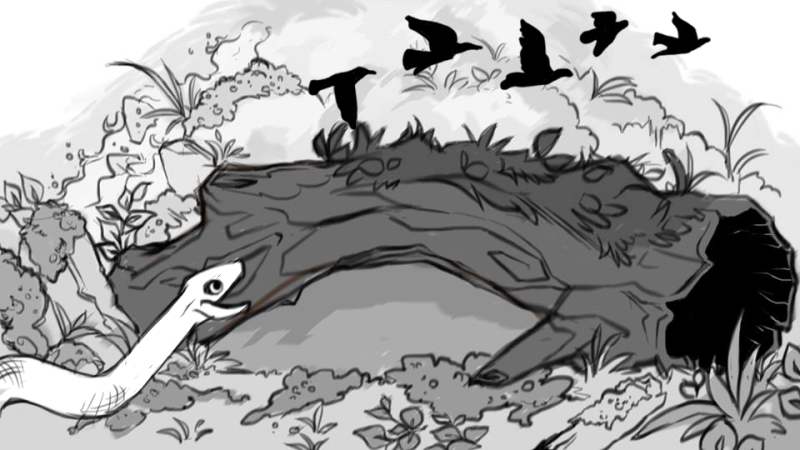
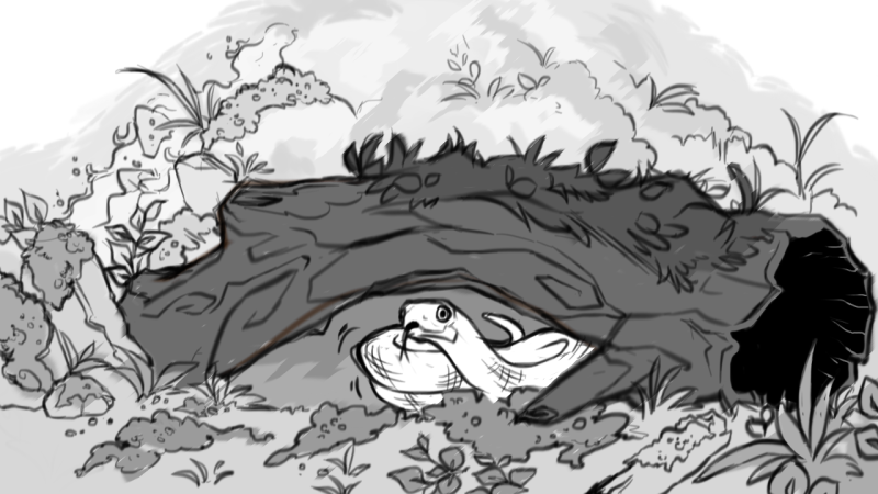 And this is where I said “B)” and went a lil off the rails and dove into RIGHT SNAKE SYMBOLISM. Adam & Eve. Apples. A rotting singular tree, with mad graphics going on inside the background! A Poison Tree, William Blake, GCSE English Literature returns to me in this moment
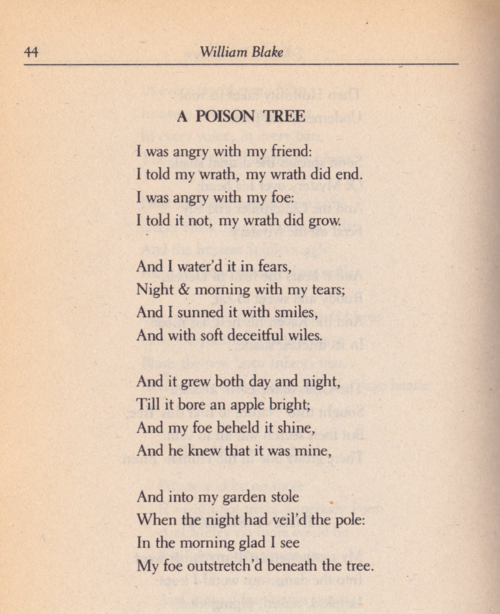


")


")


")


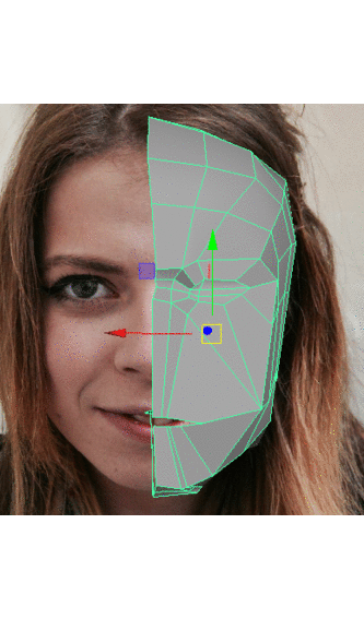
 Tests! I wanted to see how my face would look pieced together as a whole, and also I wanted to see how my eyes would look with an actual ‘eyeball’ i.e. a sphere polygon. The completely symmetrical face was really creepy and a lot more changes would have to be made, but this was a positive realisation as it would give me more room to model the asymmetrical features of my face. The sphere as an eyeball didn’t cut it on its own, the eyeball itself anatomically takes up about 80/90% of the eye space but in the negative eye space there’s bits of pink flesh. Negative space! I wanted to fill this detail in, what I did was select the loop of edges in the eye hole, move them backwards and scale them inwards, and then filling the mesh hole with a face. I used this technique to model my nostril holes too.
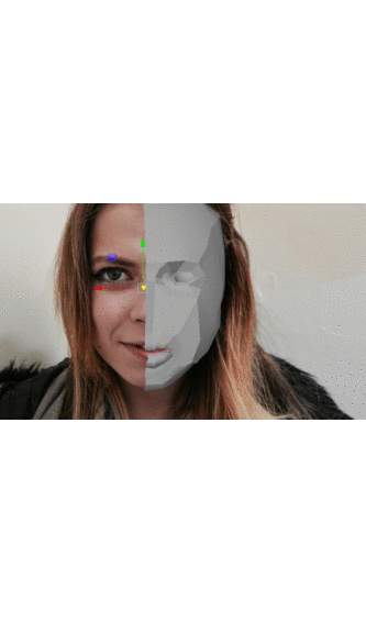

")


 Spirited Away – Haku Character gifs. Hayao Miyazaki – Studio Ghibli